CSS Subgrid is making my life easier
 Aug 26th, 2024
For the last 15 years, a recurrent struggle I had with taxonomy pages, whether it be an ecommerce site or not, is managing different length of texts in item listing pages. I feel like I used all the tricks in the book and this was still a pain point on each site.
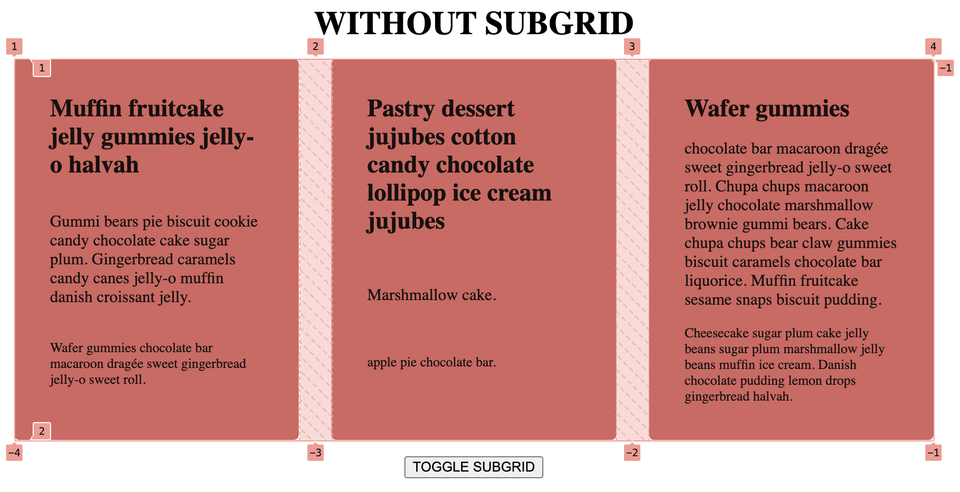
The most classic example is a product picture, name, price, and maybe categories inside an average 300px wide container. Sometimes the product name would take only one line, sometimes two. Same for the categories names. I frequently use fixed heights and/or CSS ellipsis, so that all the prices, names and other elements would algin vertically.
But that time is finally over, thanks to CSS subgrid, which is really easy to use.
In the pen below, I reproduced this scenario with quite extreme difference in text lengths to make the subgrid
difference visually more obvious.
As you can see, it only takes adding the following two lines to the article tag for its three elements to inherit the track sizes of its parent grid. As a result, the grid-gap defined in the parent grid will be passed down to the subgrid! It felt couterintuitive first.
article {
    grid-template-rows: subgrid;
    grid-row: span 3;
}
It's easier to picture with the element inspector pinned on the parent grid. Without subggrid the parent grid is just a single track.
With subgrid and span 3 the parent element has three rows now.
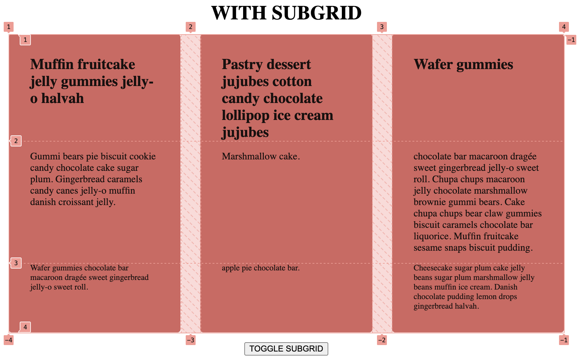
A nice quality of life improvment for sure.